DESIGN PRINCIPLES - EXERCISES

Week 1 - Week 14
Phoebe Ansel (0340165)
Design Principles
Exercises
INSTRUCTIONS
EXERCISES
Final Project: Cultural Relationship
For our final project, we were told to create a composition that will represent our relationship with the culture. We were told to visit KL to find inspiration and to get familiar with the culture.
I went to KLCC to take pictures of the twin tower, walked around bukit bintang and also went to Jalan Alor.


While thinking about what composition I wanted to create, I started reflecting on my relationship with Malaysia's culture and what I like most about it. Although I am Indonesian, my time in Malaysia has been surprisingly fun and bearable. I initially thought I would be homesick but I genuinely found myself really enjoying my time here. So I had an idea to make a composition of everything that made my stay here in Malaysia enjoyable and bearable - like a 'survival kit'.
One thing I love is the people here. The people here are very diverse, with a quick stroll in the street, we will be able to hear at least 2 languages spoken by the locals here. Although they speak different languages, one thing I noticed is that the people here are very friendly, they would always try to communicate with us even when they do not speak the language well. There are also a lot of foreigners here, mostly foreign students and tourists. So I decided to make a collage of the people here in Malaysia, I gathered around 100 portraits of the people here. I took pictures of people working at the stall in Jalan Alor. While I was in KLCC taking pictures of the twin tower, some people were very friendly and they let me take portraits of them. This is one of the portraits I took.

The second thing I love is the Food here. I decided to do a compilation of the food I love here. I gathered pictures of the food I ate in jalan alor and other places as well. While searching for inspirations to make the composition look interesting, I came across this picture and was inspired to create that collage.

I wanted the portrait to represent Malaysia's culture as well. So I decided to use the figure in Malaysia's RM (he is Malaysia's First Agong, Seri Paduka Baginda Yang di-Pertuan Agong Pertama Almarhum Tuanku Abdul Rahman ibni Almarhum Tuanku Muhammad), as money is also a part of the country's culture.

I decided to use photoshop to compile all the images together.
This is the Final Result of my composition:

Project 2: Self portrait
For this project, we were told to create a self protect with any materials that we have used and explored with throughout all our exercises. For this project, I decided to use photoshop to create my self portrait.

For this project, I decided to create a self portrait that would reflect how I truly see myself. I edited a portrait of myself and decided to cut out my face. I see myself as someone who overthinks everything and someone who is very self-critical. I spend a lot of time reflecting and thinking about every single detail before taking action or coming up with a solution to any problem that I am facing. I decided to cut out my face and added a galaxy picture, to show that there is an entire universe inside my head. the reason why I chose to do that is that I see my mind and thoughts as a limitless universe. It is a system of millions or billions of stars, together with gas and dust, held together by gravitational attraction. As I am constantly swarmed by both negative and positive thoughts throughout the day, I'd still try to be someone who is always 'put together', someone who is always calm and collected.
The universe consists of a lot of things, such as the sun, the moon, other planets, and black holes.
A black hole is a force so intense, that no matter or radiation will be able to escape it. That is how I see my thoughts sometimes, sometimes on bad days I feel like my thoughts would be so dark and they would bring me down, they would be so intense and I would be constantly reminded of them throughout the day - and on bad days I feel like I would not be able to escape the negative thoughts.
However, on some days, I see my thoughts as the sun. On better days, I would be able to comfort myself throughout the day, filling my thoughts with so much positivity, coming up with great solutions to every problem and facing, and constantly reminding myself to see the brighter side.
I was also heavily inspired by two of these quotes.
“Everybody has a little bit of the sun and moon in them. Everybody has a little bit of man, woman, and animal in them. Darks and lights in them. Everyone is part of a connected cosmic system. Part earth and sea, wind and fire, with some salt and dust swimming in them. We have a universe within ourselves that mimics the universe outside. None of us are just black or white, or never wrong and always right. No one. No one exists without polarities. Everybody has good and bad forces working with them, against them, and within them.
PART SUN AND MOON by Suzy Kassem”
“Never apologize for burning too brightly or collapsing into yourself every night. That is how galaxies are made.”
―
―
I think that it is a great reminder, to understand that there is darkness and light in everyone, that not everything in life has to go smoothly or perfectly.
I also decided to add an article about what overthinking feels like in the background. I feel like a lot of people don't really understand what it truly feels like, and how heavy and difficult it might feel. I decided to leave my entire image black/grey or colourless except the image of the galaxy because I wanted to show that although there are days where I feel like my thoughts are a dark place, throughout the years I have learned to understand that it can be and it is meant to be a beautiful place, filled with light and positivity.
Lecture 9
1. Symbols
Definition : a mark or character used as a standard representation of an object, function or process.
- Icon Icons represent the exact thing they look like. Icons are not conceptual imagery, they are practical and useful.
- Shape as Symbol
Shapes are two-dimensional areas with a recognizable boundary. They can be open or closed, angular or round, big or small. Shapes can be organic or inorganic. They can be free-form or geometric and ordered.
 |
Meaning of shapes :
- Circle : wholeness, completion, eternity.
- Triangle : power, stability.
- Square/Rectangle : conformity, peacefulness, solidity, security, and equality.
- Sign as Symbol
A sign is language in its own right and its meaning universally shared by people belonging to a specific geographical location. It is mainly used to give warning to people, inform them or to regulate their conduct in certain instances.
- Concept as Symbol
Concept is a mental representation or an abstract object or an ability. It represent a concept related to the brand.
- Gesture as Symbol
Gesture is a movement of part of the body, especially a hand or the head, to express an idea or meaning.
- US : OK
- Japan : Money
- Brazil : Insult
- France : "You're a big zero!"
- US : good
- Parts of West Africa : Offensive Gesture
- US : Loser
- China : 8
- Colors as Symbol
Colors hold significance for people around the world. Not only do colors influence emotion, but they also hold meaning in religion and various cultures.
2. Image
Definition : is a representation of the external form of a person or thing in art. Images is first captured by the natural object which is the human eye.
Characteristics of an Image
- Two-Dimensional Image : photograph or screen display.
- Three-Dimensional Image : statue or hologram.
Types of Image :
- Still Image : single static image (still life).
- Volatile Image : an image that will only exist in a short period of time.
- Vector Image : creation of digital images through a sequence of commands or mathematical statements.
- Monochrome : where one color is presented in different values and intensities - or different shades of a single color.
- Grayscale Image : a method of representing black and white images on a computer.
3. Words
Purpose : to convey the concept or idea the designer wants his/her audience to understand.
Exercise 9 : Symbol, Image and Words
Tools and Materials : photography
Description : create a composition using photography and choose if we want to do either symbol, image or words in an A4 format, save it as a pdf and include it in the blog.
For this exercise i decided to use a picture i took recently in a bridge in jakarta, i decided to alter the colours a little bit and played with its contrast in photoshop.

These are a couple of my favorite pieces I saw at the Gallery.
The first thing I saw when I entered the gallery was the colorful squares on the wall. It was done by Mit Jai inn, a pioneer of Thai contemporary art. I found the artwork very interesting, it wasn’t neat or tidy like any other artwork you would typically see. It was very vibrant, colorful, and the squares vary in sizes and texture.
The next thing that caught my eye was this portrait of a boy by Thanathorn Suppakijjumnong. This was probably one of my favorite pieces in the entire gallery. If you look closely, it is actually made of folded tiny pieces of paper. On each piece of paper the artist places words of wisdom, such as ‘Don’t judge people by their looks’, ‘Try again don’t give up’ and many more. The portrait of the boy might be the artist’s self portrait as a child. In my opinion, the artist might be trying to show words of wisdom and advices that he has received from a young age up that shaped him into the person he has become today.
This next piece was very interesting to me, because although it was made with charcoal and other mediums, you could see your own reflection on it. I didn’t quite understand the piece at first, but when I read the story behind the piece, I realized that it was a very deep and meaningful artwork, with a very interesting back story. The artist, Shilpa Gupta, asked 100 people to carry bags and suitcases covered in the words “there is no explosive in this” around the streets of London. In this work, she illustrates objects that are confiscated in airports. She addresses that fear has become a part of life in many parts of the world, due to threats of various kinds.
On the corner of the gallery, I found this piece, and light immediately caught my eye. It is a black unlit chandelier that suspends from the gallery’s ceiling and underneath it is a light box projecting an image of an X ray of the lighting fixture. It was different as we would normally see the shadow/silhouette of an object to be completely black but in this piece we see that the silhouette is illuminated while the object itself is completely black. I thought this was a very creative idea.
The next piece is a series of photographs of a man dressed in a bright pink suit, standing in an empty island. He definitely stood out in this photographs because the neon pink color of his suit contrast with the natural colors in the background. In my opinion, his suit my portray his need to show off and constantly stand out. His empty pink shopping cart that he seems to carry in every photograph is the embodiment of the never satisfied, self centered consumer searching for fulfilment in a capitalist world. We can see that although he is in a beautiful place with an amazing view, he is still carrying a shopping cart. I thought that this was a very relatable message that we often see in the world today. Most tourists today, yearn for consumer’s paradise, they are only interested in collecting exotic destinations, shopping, and showing off.
This was probably the most different piece amongst others, as it was in the form of a video played on a loop. It was very calming and relaxing to watch as the man slowly walked across the screen. It was a video of a man, carrying what may seem like a plastic doll, while walking in the sea. It was inspired by the artist, Martha Atienza’s family seafaring history. The work is based on Bantayan Island and the municipality of Madridejos, where she grew up. She addresses the problems the fishing community have faced due to poverty, environmental change, and the long absence of family members at sea.
This piece caught my eye as it reminded me of a giant toilet paper. The artist used a common symbol of a heart tattoo as a guide and deliberately crumpled the paper’s surface, trapped the line’s surface and added color to it. It is the most elementary acts of art making. It blurred the lines between abstracted and illustrated forms, and it shows that a simple heart shape can create so much more. It reminded me that although it may start of as something simple, when done right, it can create a harmonious and beautiful art. Art does not always have to be done with complicated and difficult techniques to make it work, sometimes art can be done it the most simple way.
Lecture 7
1. Rhythm: is defined as a strong, regular, repeated pattern of movement or sound. It’s created when one or more elements of design are used repeatedly to create a feeling of organized movement.
a) Alternating rhythm describes an artwork that contains a repetition of two or more components that are used interchangeably. Some alternating rhythm examples include alternating light and dark colors or placing various shapes and/or colors in a repeating pattern.

b) Random rhythm describes an artwork that contains repeating elements without a specified order or arrangement. Some random rhythm examples include splatters of paint or shells on a beach.

c) Regular rhythm describes an artwork that contains repeating elements with a specified order or arrangement that can be measured. Some regular rhythm examples include evenly spaced windows or tiles.

d) Progressive rhythm describes an artwork that contains repeating elements in a pattern that change either in size or color as they repeat. Some progressive rhythm examples include building blocks arranged from smallest to largest and spirals.

2. Movement: the path the viewer’s eye takes through the work of art, often to focal areas. Such movement can be directed along lines, edges, shape, and color within the work of art.
3. Harmony: it is the visually satisfying effect combining similar or related element. The repetition of design elements like color, texture, shape, and form is one of the easiest ways to achieve harmony to create a composition.Exercise 7 : Rhythm, Movement and Harmony
Tools and Materials : collage materials/glue, A4 paper
Description : choose either rhythm, movement or harmony and create a composition using an A4 paper in either 2D or 3D.


Lecture 6
1. Dot:
The smallest element of graphic design.
The defining characteristic of a dot is that it’s a point of focused attention.
Dots are the focal points in our compositions.
a. Centre: Dots centrally placed within a composition create symmetry and are neutral and static, though they tend to dominate the space around them.
b.Off Centre: Dots placed off center create asymmetry. They are dynamic and actively influence the space around them.
Relantionship between dots:
One dot overlapping another creates a figure/ground relationship.
One dot is now in the foreground and the other is pushed into the background.
Overlapping dots form more complex shapes than either of the individual dots.
This resulting cluster of dots is in itself a new dot with a different form.
2. Line:
A line is a series of points adjacent to each other / The arrangement of dots with a constant distance between them.
Line is much more dynamic in character than a dot. Where a point has no dimension, a line has one dimension.
The simplest form of a line is a straight line (—————–).
Types of line:
a. Outlines: Lines made by the edge of an object or its silhouette.
b. Contour Lines: Lines that describe shape of an object and the interior detail.
c. Gesture Lines: Lines that are energetic and catch the movement and gestures of an active figure.
d. Sketch Lines: Lines that capture the appearance of an object or impression of a place.
e. Calligraphic Lines: Precise, elegant handwriting or lettering done by hand. Also artwork that has lines like an elegant handwriting.
f. Implied Line: Lines not actually drawn but created by a group of objects seen from a distance. The implied line is the direction an object is pointing to, or the direction a person is looking at.
3. Scale:
Scale is the relative size of different objects or of an object to a common standard.
It refers to the size ratio between everything within the image.
Humans judge the scale of something according to body size. Some of the most common adjectives that apply to scale include:
Life-sized
Miniature
Oversized
Enormous
Scale can:
create contrast
add emphasis
provide proportion
create visual hierarchy
create structure and order
create tension through the exaggerated & unexpected size of an object
4. Size:
Size is the physical dimensions of an object. It is how big or small something is.
In design, size can function, size can attract or size can organize.
Size plays an important role in making a layout functional, attractive and organized.
a. Function
We have to think about how the piece will ultimately be used and whether the its use will end up limiting the size.
b. Attract your audience.
You can contrast large and small elements or make a image larger and crop it in an interesting way.
c. Organize your piece.
To attract attention, make the most important element the largest and the least important element the smallest.
Bigger elements are also perceived as higher in the hierarchy and smaller elements are perceived as lower in the hierarchy.
Exercise 6 : Dot, Line, Scale and Size
Tools and Materials : pencil, pen, paint, glue, cut paper, A4 paperDescription : choose either dot, line, scale and size and create a composition in a A4 white paper using the materials assigned.
For this week's exercise, I decided to draw a circle in different sizes, I used the cap of a marker, the cap of a plastic bottle, the circumference of a masking tape, and the cap of a water bottle to create the circles. I then decided to color it black and white, it took me quite a long time to get it done.


Lecture 5: Alignment, Direction and Perspective
On the 6th week of class, we learnt about Alignment is the placement of visual elements so they line up in a composition. In design, we use alignment to organize elements, to group elements, to create balance, to create structure, to create connections between elements, to create a sharp and clear outcome.
In design there are two alignment principles: Edge alignment and Center alignment.
Edge Alignment
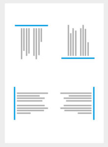
Edge alignment is either to the left, right, top or bottom.
Center Alignment
Center alignment as it states is aligned to a center line down the middle or across the horizontal.
Alignment is often an invisible line visual elements are aligned to but can also be hinted at physically. Alignment can be used to achieve a particular look and feel. One should always be conscious when working with alignment to achieve the intended result.
Good Alignment
Bad Alignment
Where visual elements are aligned, a composition can appear clear, confident, elegant, formal and trustworthy. Good alignment is invisible i.e. this doesn’t have to be a literal line in your design.
Mixed Alignment
If mixed alignment is intended as part of a design, it can appear more radical, dynamic, free and playful.
Exercise 5 : Alignment, Direction and Perspective
Tools and Materials : plastics, recycled materials, glue, A4 paper
Description : choose either alignment, direction or perspective and create a composition using the materials assigned.
For this exercise, I searched for inspiration on pinterest and saw that a lot of people were using scrap paper to create flowers. I wanted to try to do something different, so I decided to create butterflies using the scrap paper I had. I also had a plastic bottle with me, so I decided to cut it in half to portray butterflies flying out of the bottle.
For this exercise, I searched for inspiration on pinterest and saw that a lot of people were using scrap paper to create flowers. I wanted to try to do something different, so I decided to create butterflies using the scrap paper I had. I also had a plastic bottle with me, so I decided to cut it in half to portray butterflies flying out of the bottle.


Lecture 4 : Pattern, Repetition, Texture and Surface
Due to the bad weather, we didn't have class on week 4. So, we continued our lecture in week 5. For this week, we were introduced to Pattern, Repetition, Texture and Surface.
1. Pattern:
Patterns are simply a repetition of more than one design element working in concert with each other. A seamless pattern is one where every element within a design (no matter how often it’s repeated) combines to form a whole. Types of pattern:
- Man-made Pattern
- Natural Pattern
2. Repetition:
Repition is the use of similar or connected pictorial elements. For example, similar shapes, colours or lines that are used more than once. Forms of repetition:
- Radiation : the repeated elements spread out from a central point.
- Gradation : the repeated elements slowly become larger or smaller.
3. Texture
4. Surface
Exercise 4 : Pattern, Repetition, Texture and Surface
Tools and Materials : white A4 paper, paint, vegetables, fruits or leaves
Description : create a pattern using vegetable, fruits or leaves print on paint and using a white A4 paper.
For this exercise, we were asked to create patterns using vegetables, fruits and leaves. I decided to create 2 patterns. The first design is a simple polka dot pattern that i created using the stem of a lemon grass dipped in pastel colour paint. The second pattern is a rose design that I created using a cabbage and the small flowers are created using a bitter gourd as the stamp.

fig 4. : polkadot design

fig 4: rose design
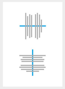
For the third week of class, we were introduced to Symmetry, Asymmetry and Balance.
1. Symmetry:
Symmetry is the visual quality of repeating parts of an image across an axis, along a path or around a center. There are several types of symmetry.
- Reflection symmetry is also known as bilateral symmetry. It is the “mirror” effect, or when one object is reflected across a plane to create another instance of itself.

fig 3.1: example of reflection symmetry
- Rotational symmetry (or radial symmetry) is when an object is rotated in a certain direction around a point.

fig 3.2: example of rotational symmetry
- Translational symmetry is when an object is relocated to another position while maintaining its general or exact orientation.

fig 3.3: example of translational symmetry
2. Asymmetry:
Asymmetry on the other hand, refers to anything that isn’t symmetrical.

fig 3.4: example of asymmetry
3. Balance:
Balance is the visual principle of making a design appear equally weighted throughout the composition.
Balance measures the visual weight of your composition, which impacts how much each element attracts your audience’s attention.
There are four basic ways to achieve balance:
- Symmetrical balance: occurs when your composition has the same visual weight on each side of an axis. Imagine perfect mirror images looking at each other around a central axis.
- Asymmetrical balance: a composition with unequal weight on both sides.
- Radial Balance: when visual elements radiate out of a common center point.
Tools and Materials : white A4 paper, watercolor
Description : choose either symmetry, asymmetry or balance and create a composition using watercolor and white A4 paper.
I decided to do an asymmetry design of the mountain and the sea, sun and the moon reflecting each other another to potray how different they are and used watercolor to color it.

fig 3.5: asymmetry of the mountain and sea
Lecture 2 : Gestalt
For the second week of class, we were introduced to 'Gestalt'.The term Gestalt means 'unified whole', which is a good way of describing the over-arching theme behind the Gestalt principles. These refer to the way in which humans, when looking at a group of objects, will see the whole before we see the individual parts. There are 6 gestalt principles.
1. Similarity
When objects looks similar to one another, viewers will often see the individual elements as part of a pattern or group. This effect can be used to create a single illustration, image or message from a series of separate elements. The similarity between different elements can be shape, colour, size, texture or value. The more commonality that individual elements have, the greater the sense of coherence, thanks to similarity.

2. Continuation
Continuation is the principle through which the eye is drawn along a path, line or curve, preferring to see a single continuous figure than separate lines. This can be used to point towards another element in the composition, and is seen where a line is cut through one object, often in a curve, aligning perfectly with a secondary element.

3. Closure
Closure is a common design technique that uses the human eye's tendency to see closed shapes. Closure works where an object is incomplete or the interior space of an element is not fully closed, but the viewer perceives a complete shape by filling in the missing information. This technique is often associated with stencilled artwork, but is also closely associated with logo forms.

4. Proximity
Proximity uses the close arrangement of elements to create a group association between those objects. If individual elements are also similar, they will tend to be perceived as a single whole, even though they are separate elements.

5. Figure/Ground
This principle describes the eye's tendency to see and separate objects from their surrounding background. A classic example uses a vase/candlestick illustration to show two faces peering at each other, but you can also see this effect in a variety of logo designs. It works because human eyes want to see the figure (foreground object) and background (ground) as two different planes of focus.

6. Symmetry and Order
This principle says that a composition should not provide a sense of disorder or imbalance, as otherwise the viewer will waste time trying to locate the missing element, or fix the problem, rather than focusing on the message or instruction.

Exercise 2 : Gestalt
Tools and materials : black marker or pen, white A4 paper
Description : create a gestalt composition using a black marker or pen and a A4 white paper.
For this exercise, I wanted to deliver a meaningful message behind my design. I decided to design is a drawing of a cigarette and smoke emitting out of it. The smoke is in the shape of a gun, basically to say that smoking kills.

Lecture 1 : ContrastFor the second week of class, we were introduced to 'Gestalt'.The term Gestalt means 'unified whole', which is a good way of describing the over-arching theme behind the Gestalt principles. These refer to the way in which humans, when looking at a group of objects, will see the whole before we see the individual parts. There are 6 gestalt principles.
1. Similarity
When objects looks similar to one another, viewers will often see the individual elements as part of a pattern or group. This effect can be used to create a single illustration, image or message from a series of separate elements. The similarity between different elements can be shape, colour, size, texture or value. The more commonality that individual elements have, the greater the sense of coherence, thanks to similarity.
fig 2.1: example of similarity
2. Continuation
Continuation is the principle through which the eye is drawn along a path, line or curve, preferring to see a single continuous figure than separate lines. This can be used to point towards another element in the composition, and is seen where a line is cut through one object, often in a curve, aligning perfectly with a secondary element.
fig 2.2: example of continuation
Closure is a common design technique that uses the human eye's tendency to see closed shapes. Closure works where an object is incomplete or the interior space of an element is not fully closed, but the viewer perceives a complete shape by filling in the missing information. This technique is often associated with stencilled artwork, but is also closely associated with logo forms.
fig 2.3: example of closure
Proximity uses the close arrangement of elements to create a group association between those objects. If individual elements are also similar, they will tend to be perceived as a single whole, even though they are separate elements.
fig 2.4: example of proximity
5. Figure/Ground
This principle describes the eye's tendency to see and separate objects from their surrounding background. A classic example uses a vase/candlestick illustration to show two faces peering at each other, but you can also see this effect in a variety of logo designs. It works because human eyes want to see the figure (foreground object) and background (ground) as two different planes of focus.
fig 2.5: example of figure/ground
6. Symmetry and Order
This principle says that a composition should not provide a sense of disorder or imbalance, as otherwise the viewer will waste time trying to locate the missing element, or fix the problem, rather than focusing on the message or instruction.
fig 2.6: example of symmetry and order
Exercise 2 : Gestalt
Tools and materials : black marker or pen, white A4 paper
Description : create a gestalt composition using a black marker or pen and a A4 white paper.
For this exercise, I wanted to deliver a meaningful message behind my design. I decided to design is a drawing of a cigarette and smoke emitting out of it. The smoke is in the shape of a gun, basically to say that smoking kills.
fig 2.7: smoking killls gestalt
On the first week of class, we were introduced to Ms Sherry and Dr Jinchi. We were also briefed about all our modules and weekly exercises we were going to have this semester. The topic of our first lecture was 'Contrast'. Contrast refers to the arrangement of opposite elements (light vs. dark colors, rough vs. smooth textures, large vs. small shapes, etc.) in a piece so as to create visual interest, excitement and drama. We were also shown examples of contrast.

fig 1.1: example of contrast

fig 1.2: example of contrast
Exercise 1 : Contrast
Tools and Materials : black and white A4 paper, glue
Description : create a composition that shows contrast with only black and white paper
For this exercise, i decided to create a contrast composition of one of my favourite disney movies, "Lion King".

fig 1.3: lion king contrast


Comments
Post a Comment